QR Code Menu Accessibility: What Most Platforms Get Wrong
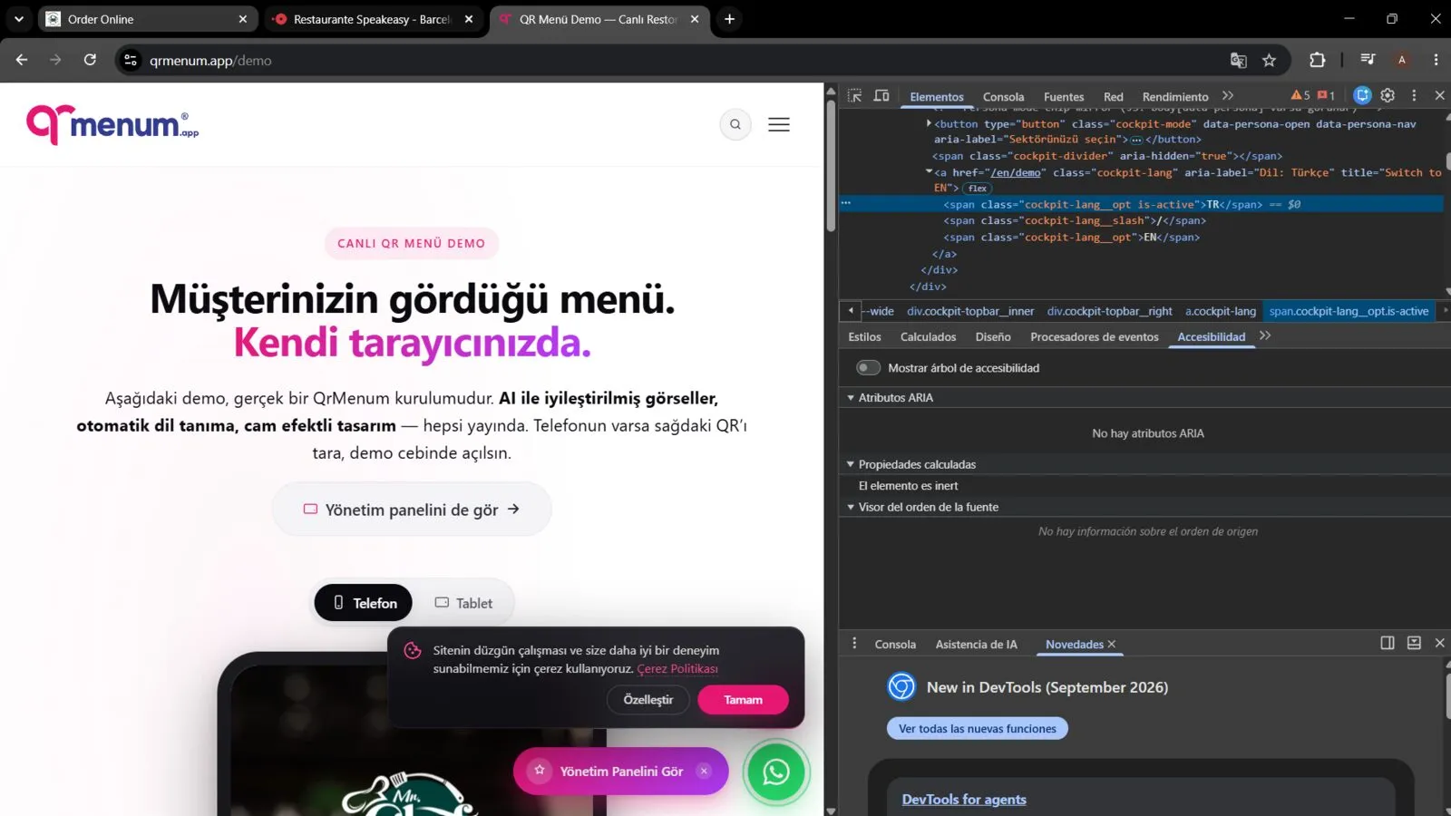
A QR menu that a sighted customer can read fine can still be unusable for someone using a screen reader — and the failure is often a two-minute fix that nobody caught because nobody checked with the right tool.
What This Is Based On
Rather than audit a specific restaurant’s live menu — which risks putting a real business’s name next to a bug that isn’t theirs to fix — this check was run against a QR menu platform’s own public demo template, the page vendors build specifically to show off what their system looks like. The findings below are about the platform’s demo interface, not about any restaurant using it, and a specific implementation like this can change at any time after testing.
What It Got Right
Two things worth naming, because they’re exactly what a lot of restaurant-facing web tools skip:
- Keyboard focus is visible. Tabbing through the page produces a clear, high-contrast outline around whatever’s focused — including on a custom-built toggle control, not just default browser buttons and links. A surprising number of custom UI components lose this entirely.
- The cookie consent banner separates categories honestly. Non-essential (“measurement”) cookies default to off, essential cookies are labeled as unavoidable rather than bundled in with everything else, and there’s a “save my choices” option that doesn’t require accepting everything to dismiss the banner.
What It Got Wrong
The demo includes a Phone/Tablet view toggle — two pill-shaped buttons a sighted visitor reads as “Phone” and “Tablet.” Inspecting the page’s accessibility tree shows what a screen reader actually announces for each one: “radio button, on.” Both of them. Not “Phone,” not “Tablet” — the same generic label, twice, with nothing to tell a screen reader user which option they’re about to select.
This is a textbook case of a common pattern: the visible label text is a separate element sitting
next to the control, not connected to it through a <label>, aria-label, or aria-labelledby
attribute. Visually it reads perfectly. Structurally, the two pieces were never linked, so
assistive technology only sees the input’s internal state, not the words next to it.
How To Check This Yourself, in Under Two Minutes
You don’t need a screen reader or a paid audit tool for this specific check:
- Right-click any control on the page (a toggle, a button, a filter chip) and choose Inspect.
- In Chrome or Edge DevTools, open the Accessibility pane inside the Elements panel (the
tab next to Styles, or via the
>>overflow menu if it’s hidden). - Look at the “Name” field. If it says something generic like “on,” “true,” or is blank — instead of the actual visible label — a screen reader user hears that generic value instead of the real option.
Run this on any QR menu builder, ordering widget, or reservation tool before adopting it, not just on the finished menu it produces — a platform-level accessibility gap like this one affects every restaurant using that vendor’s toggle component, not just one page.
Why This Matters Beyond Compliance
An inaccessible toggle on a demo page is a minor annoyance. The same pattern on the page a customer actually uses to order or reserve a table is a lost customer, and — depending on jurisdiction — a real legal exposure under accessibility law, not just a nice-to-have. It’s also exactly the kind of thing that doesn’t show up in a platform’s sales pitch, which is why checking it yourself before committing to a vendor is worth the two minutes. For the broader technical trade-offs between a QR menu as a plain page versus a PDF, see static PDF menu vs. QR code menu: the real difference for SEO and how to design a QR code menu page that still ranks in Google.